Wonders & Blunders
/antwerp station
king's cross station at rush hour
My wonder and blunder are both stations both originally built in the nineteenth century and both recently modernized.
Antwerp station, designed in 1895 by Louis Delasencerie, is by no means huge, but is a Beaux-Arts jewel with a magnificently lofty glass domed waiting hall reminiscent of the Paris Opera, from which grand stairs lead up to the original elevated tracks below the single great arch of the train shed. What makes the station so special though is what has been done recently when the decision was taken to add eight new tracks below ground, four of them being new high speed through lines.
This transformation has been made in the most spectacular fashion by opening a huge atrium in the centre of the building with trains on three different levels and an extra intermediate floor for tickets, cafes and shops. Standing by the upper platforms with all the intricacy of the original great glass roof above you and watching the trains and people moving on so many levels below is exactly what a station should be about.
My Blunder, perhaps surprisingly is the much-praised Kings Cross, where Cubitt's wonderful original building and McAslan's fine new extension nevertheless combine to make something very much less than the sum of its parts. The new work is all done with great skill and the best of intentions but I have, as I walk through the station twice a day, come to the view that the design has a serious unexpected weakness.
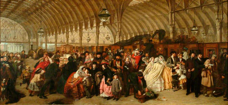
The problem is that in ridding the magnificent Cubitt train shed of all the 1970s tat, the project has also completely drained it of the bustle, romance and excitement that are essential characteristics of a great station. William Powell Frith's painting 'The Railway Station' shows what such places should be like but instead we have something quiet and lifeless; a boarding gate rather than a departure lounge.
Would JK Rowling still see the station as the best terminus for the Hogwart's express or has the magic completely left?
Primarily the difficulty arises because of the new ticket barriers, positioned to exclude everyone except passengers who already have their tickets from the train shed itself. Those barriers, if they are necessary at all (they are left open much of the time because they have to be kept manned in case of emergencies), could be at the platform ends instead. Even if convincing reasons are found to leave them where they are, there is no reason why a few shops and bars could not be allowed inside this ring of brushed steel to bring the entire space back to life.
I think there's a very important lesson here for those working with great buildings the integrity of the historic fabric is only half the story. Something should be done now to give the lifeless acres of new stone flooring at Kings Cross back to the public so that we can all appreciate a truly great station as it should be.
The railway station by William Powell Frith, Royal Holloway
Article published in a shortened form in Building Magazine, 15th March 2013 in the Wonders & Blunders column


